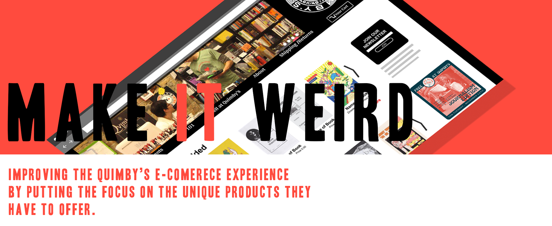
Overview:
As learning exercise in General Assembly we were tasked with redesigning the e-commerce experience for a real local Chicago business. I choice a place I frequent as a costumer and consignment seller ,Quimby's Alternative Book store. With only my recently acquired UX knowledge, a mock persona , and two weeks, I got work on a mid-fi mock up for a new e-commerce site for a place they sell books about witchcraft.
Team:
Team of one
Duration:
a 2-week design sprint.
Methods:
-Competitive analysis
-Comparative analysis
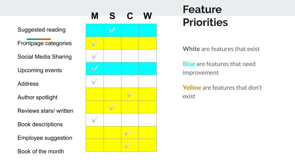
-Feature prioritization
-Card Sort
Tools:
-Figma
Problem:
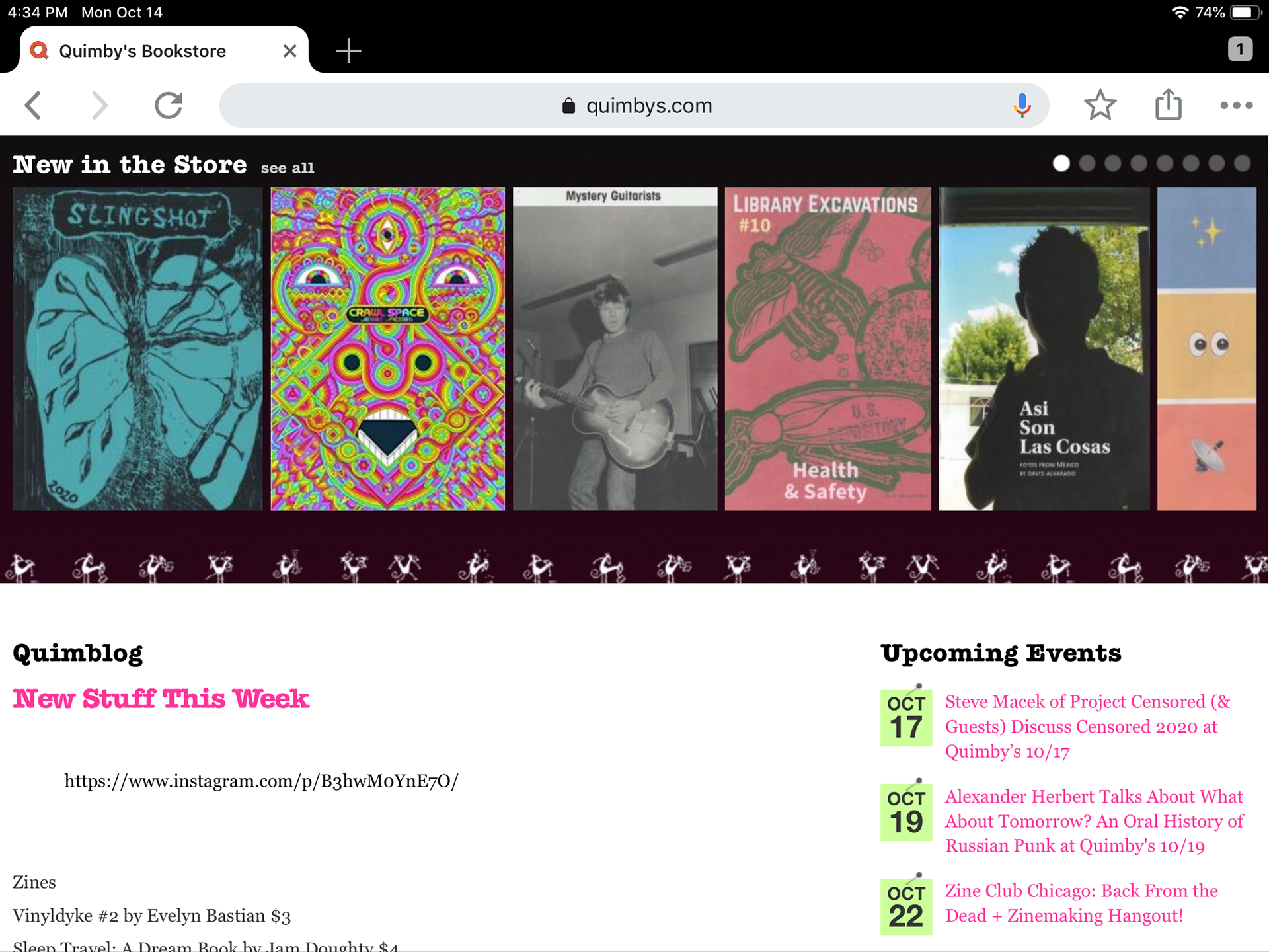
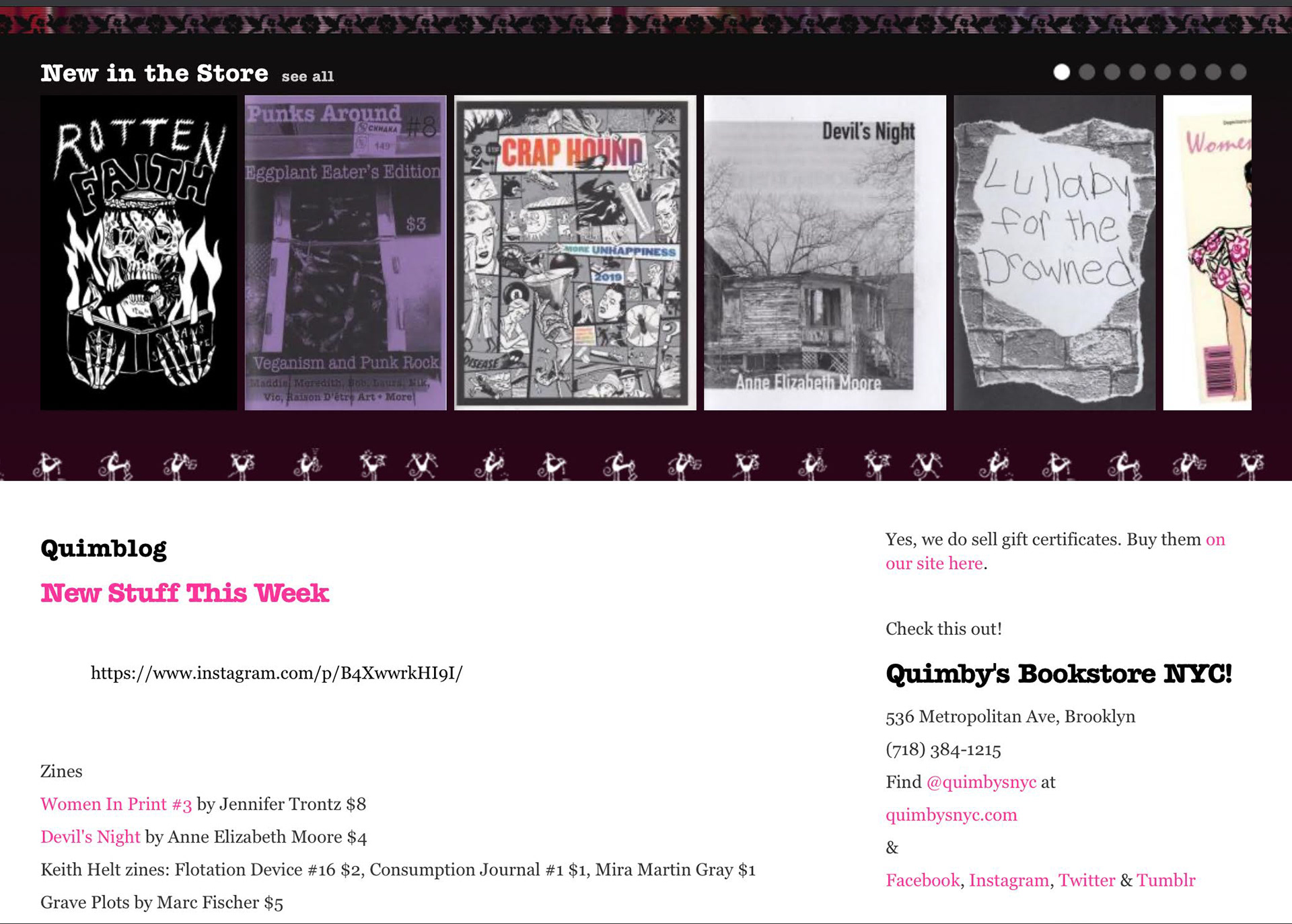
The current site has sparse and somewhat confusing navigation; it does little to highlight the unique products and events Quimby’s has to offer.
Solution:
Improve the current sitemap with a redesign that brings attention to what makes Qumiby’s unique shopping experience, and improves the intuitiveness of the navigation.
Pain Points
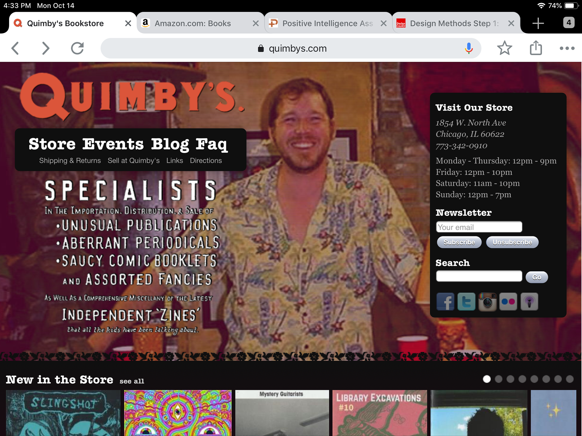
1. The site masthead takes up too much real estate until .
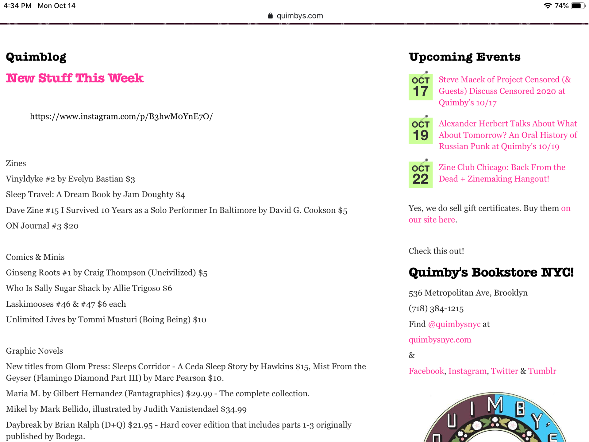
2. “New stuff this week” is the only section and it’s used in two different places.
3. The user experience is text heavy.
4. The site leaves the page too often to compete flows.
5.There are dead links.
Research
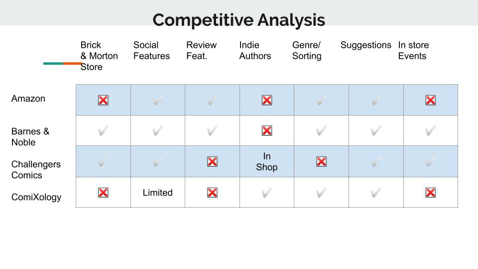
you’ll notice from this chart that bigger competitors like ComiXology, Amazon, and Barnes and noble lack events and indie artist support. These are the feature that should be highlighted on the Quimby’s site.
We can see most of these examples follow the faceted sort model for their products.
Challengers prominently advertises it’s upcoming events.
None feature both events and independent publications as prominently as Quimby’s
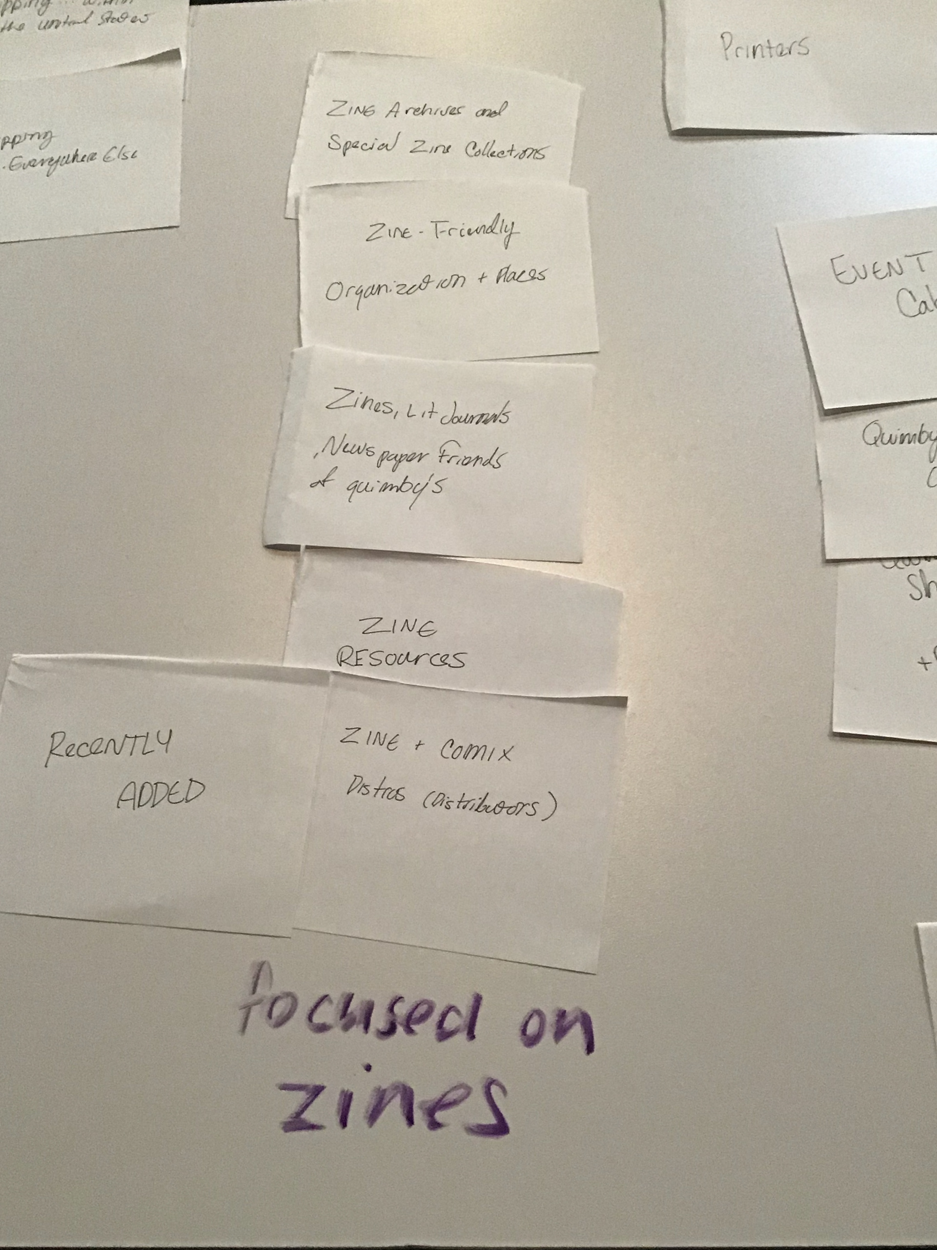
Open Card Sort
I asked 4 people to do an initial open card sort to get an Idea of how someone with no experience of the site would sort it’s pages. most people arranged the shop section similarly to the original site but sections on zines where often placed together.
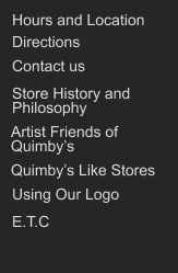
The entire original FAQ section, which featured the most articles, was it’s piece spread across the site
Insight:
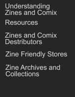
Affinity Mapping and Card Sorting revealed that Zine’s, the main product of Quimby’s, was a foreign concept to most people. That information on the site needed its own section.
Closed Card Sort
I came up with new headers, well I kept what worked like “shop, shipping/returns”, but introduced a “Zine 101” and got rid of “FAQ”. With these new labels I asked two new participants to do a Closed Sort to see if they worked. 3 Users responded well to the New Pages.
Persona:

The user: Insta Influencer
What matters most: Uniqueness
Hunts for items that are quirky, original, or on-trend
-Returns 30% of items purchased
-Prefers to complete their purchases in person
-Wants to attend unique events
-Shares favorite finds and experiences, and reviews their purchases, on social media
-Returns 30% of items purchased
-Prefers to complete their purchases in person
-Wants to attend unique events
-Shares favorite finds and experiences, and reviews their purchases, on social media
Building The Wire frame/Prototype
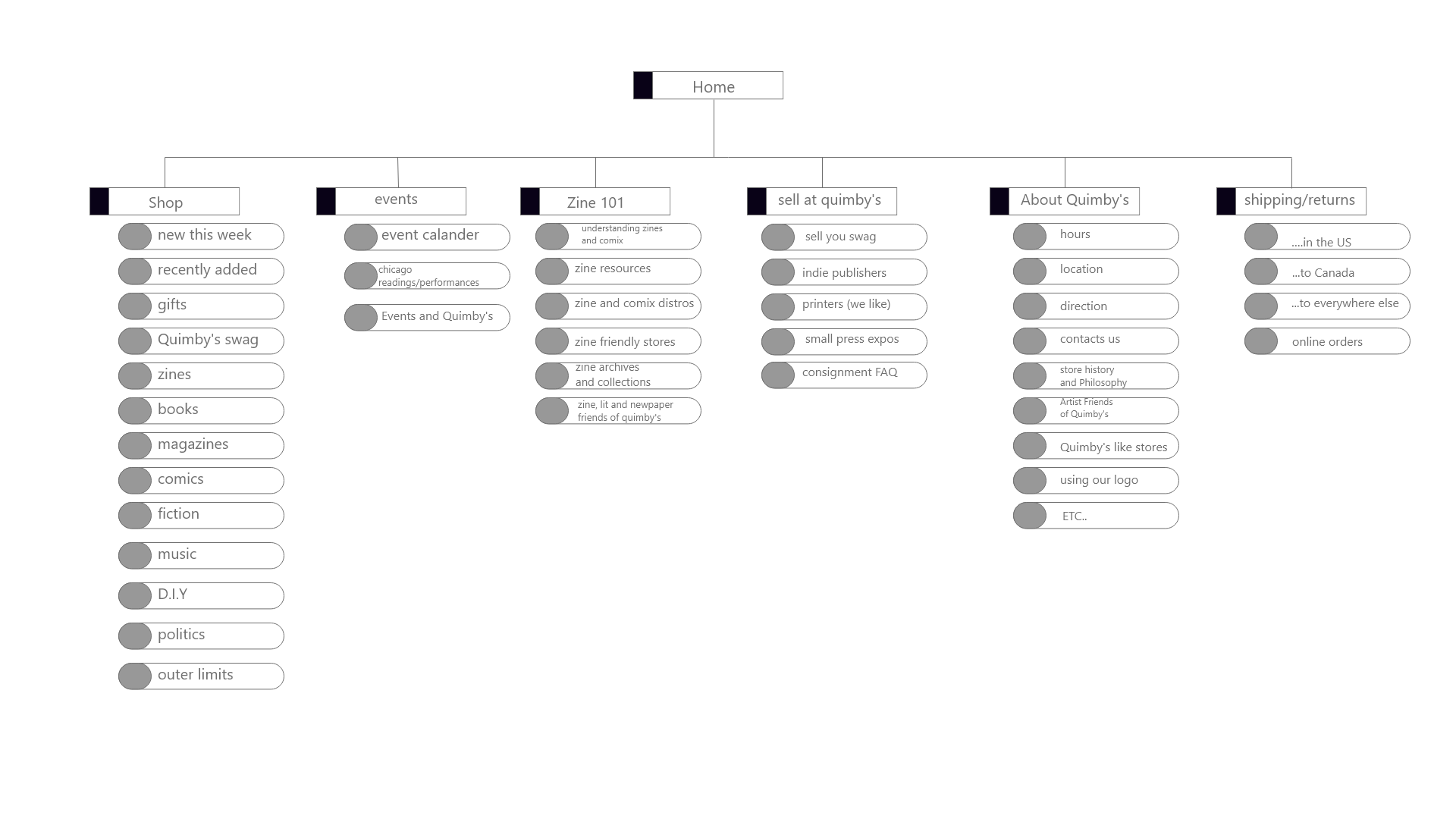
Sitemap
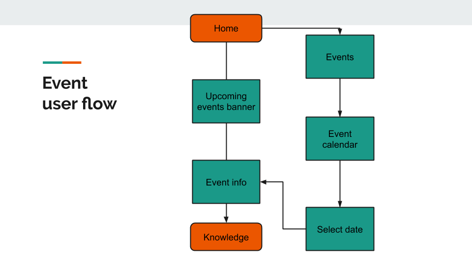
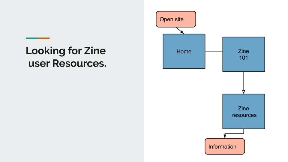
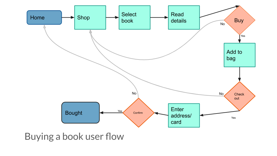
Userflows
Three basic user flows where developed. Helping me focus what parts of the wire frame needed to be prioritized.
Prototype One
before
after
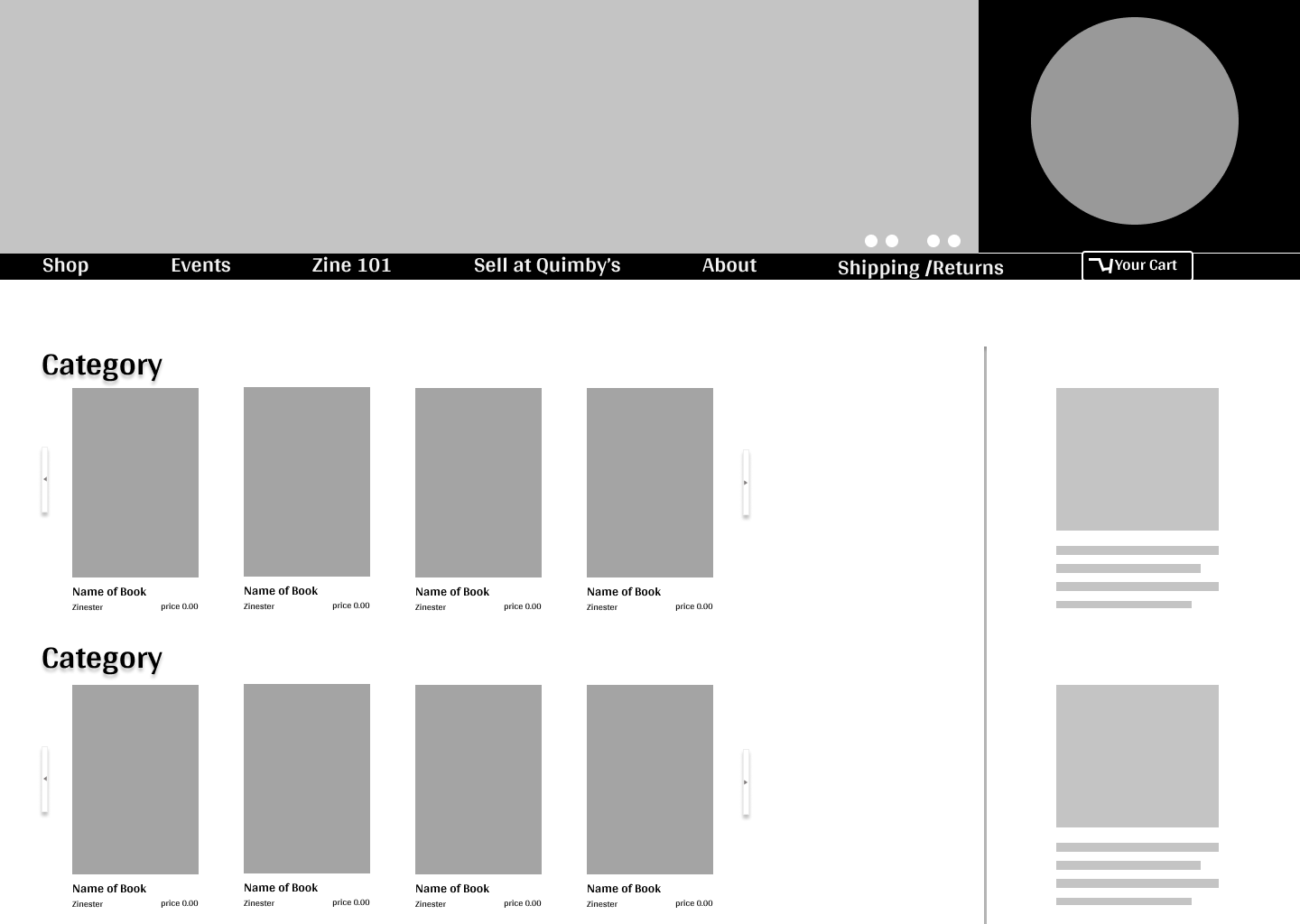
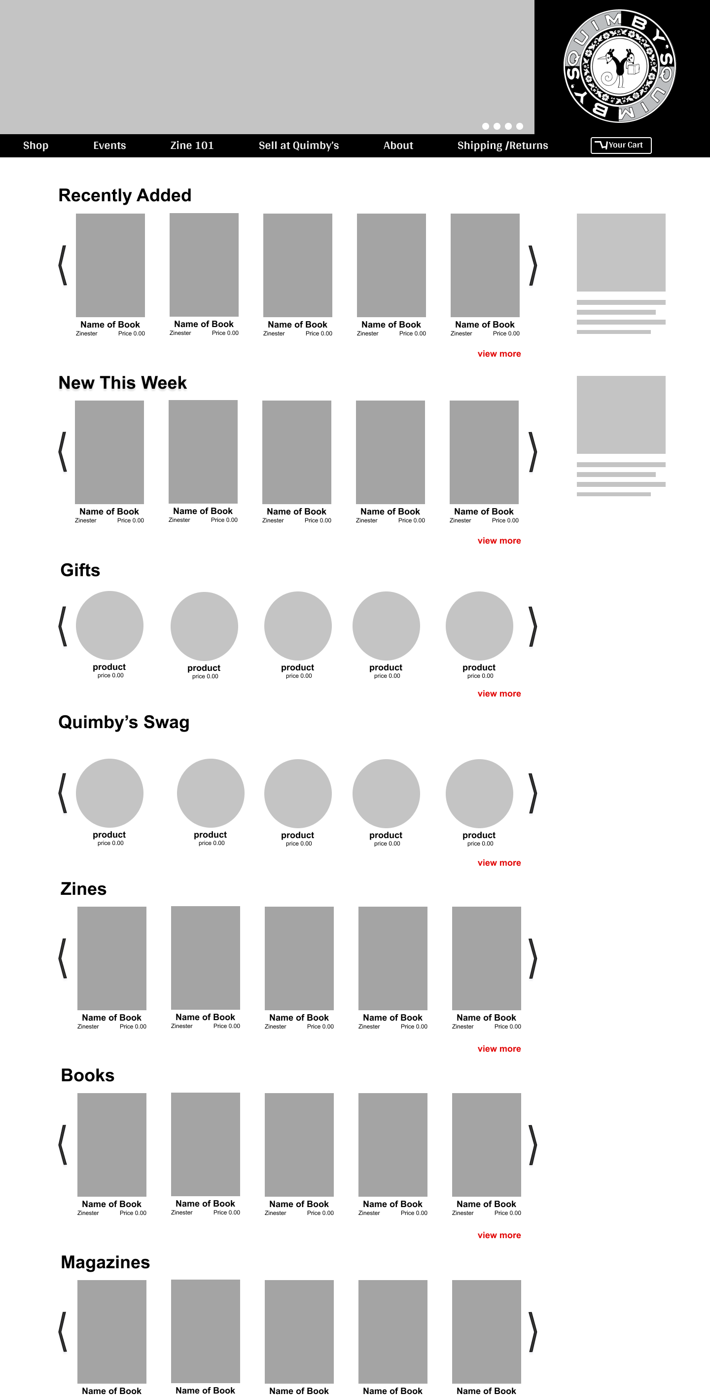
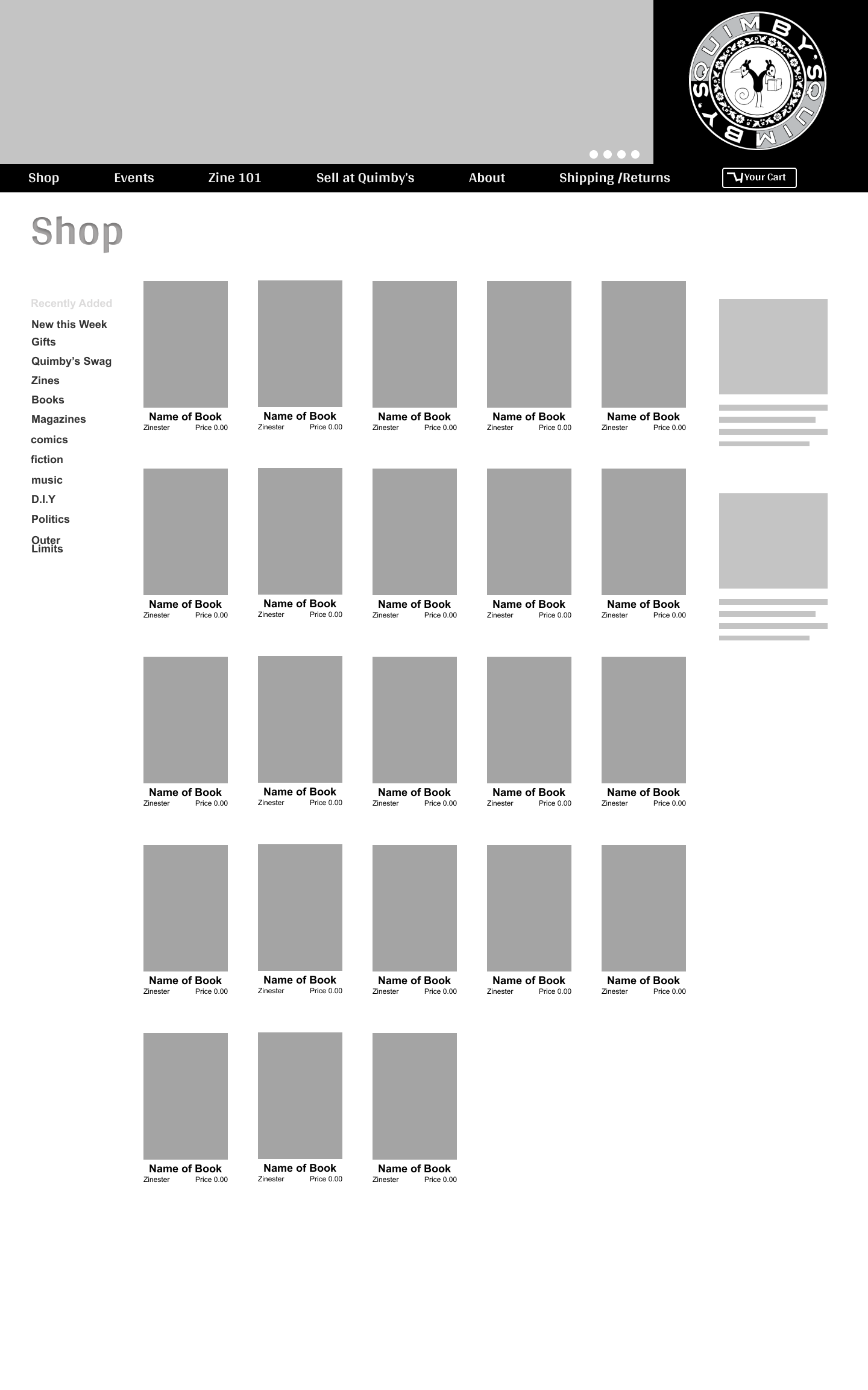
The store section was given more visual emphasis. It also added a more easily readable faceted sort.
before
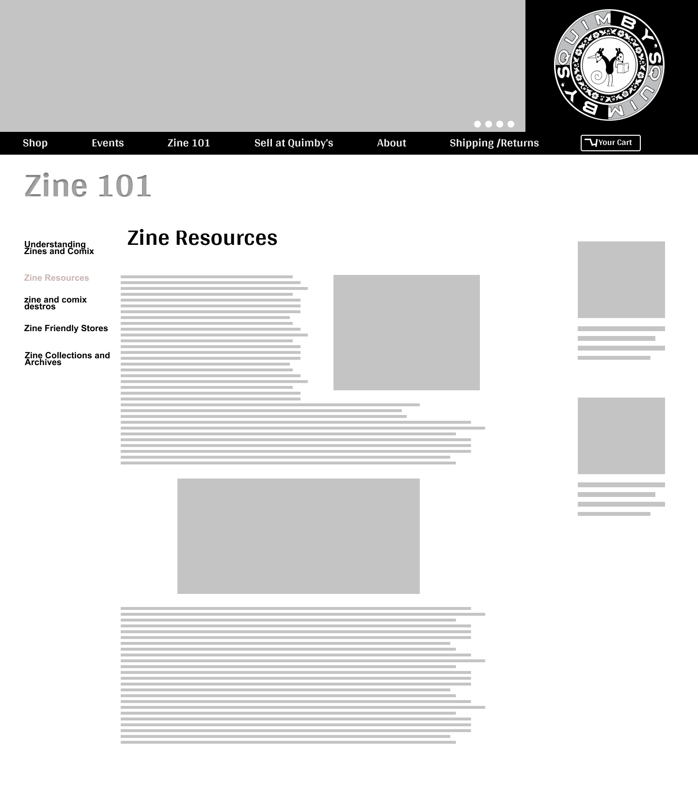
after
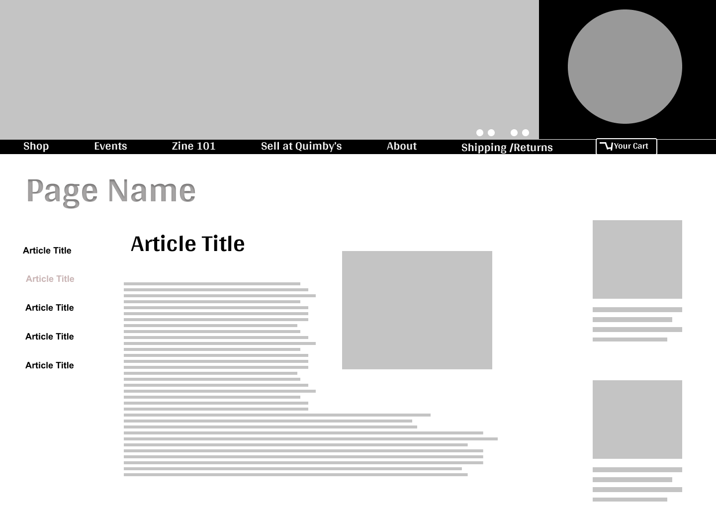
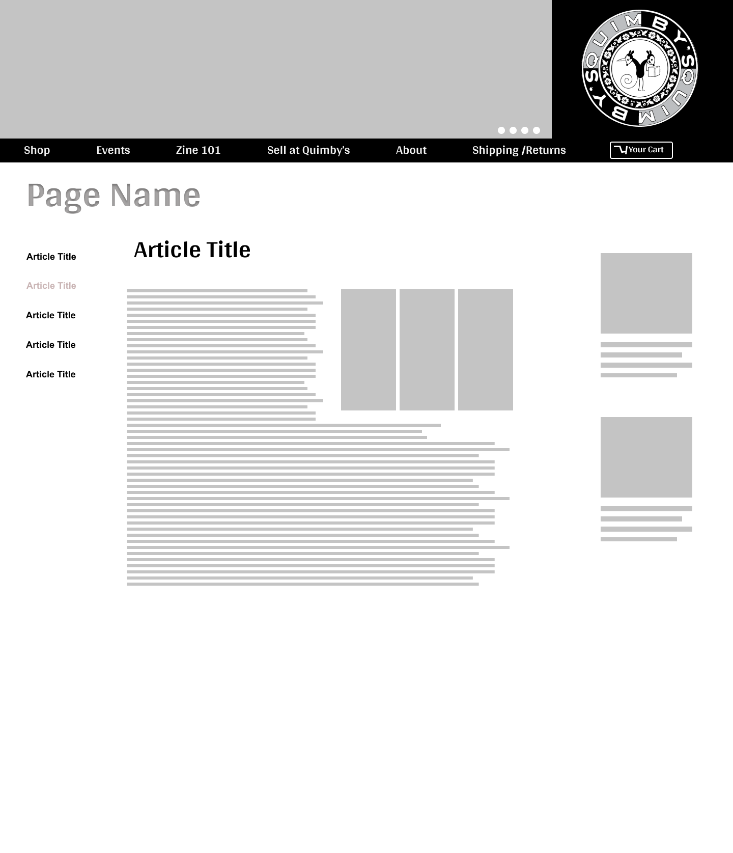
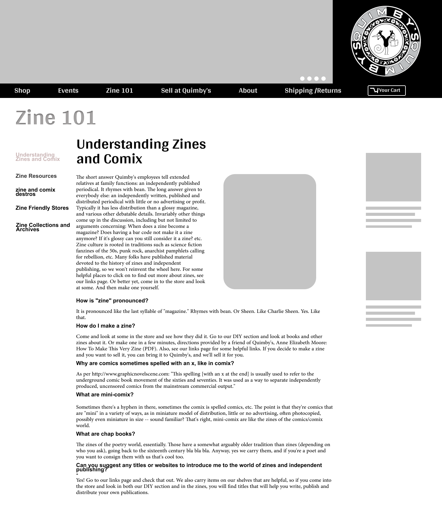
I created a universal article layout with side nav for each specific subject so it was more easily found by the user. I purposely left the text and pages general to get a better since of user expectations from the layout itself during usability testing.
back
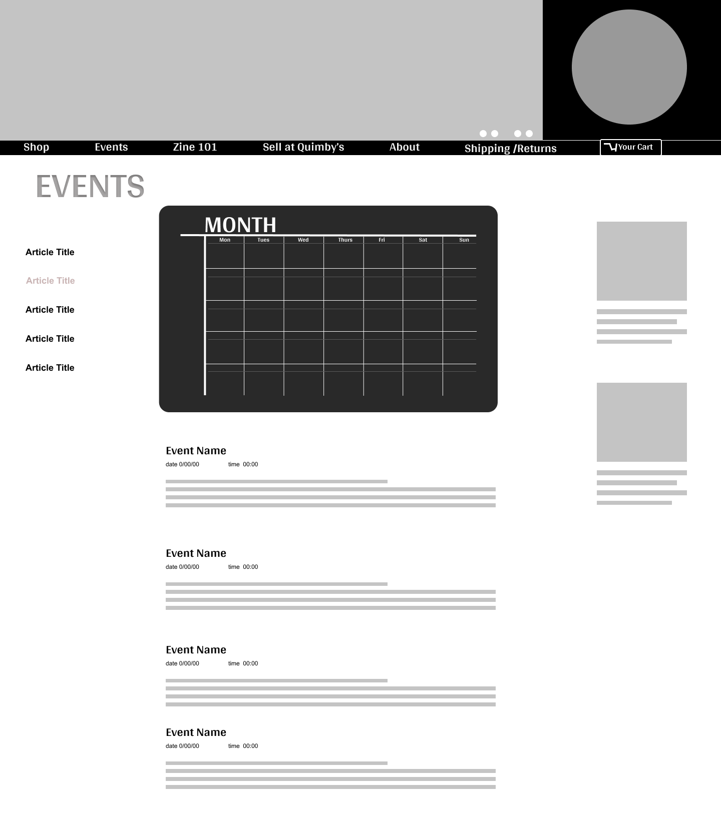
after
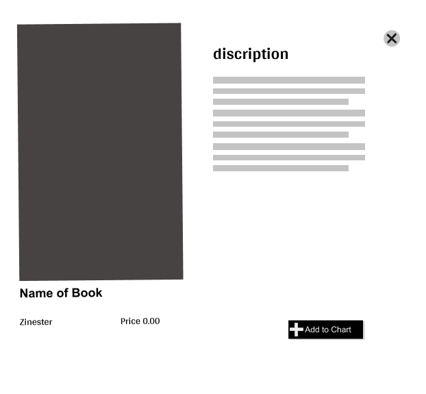
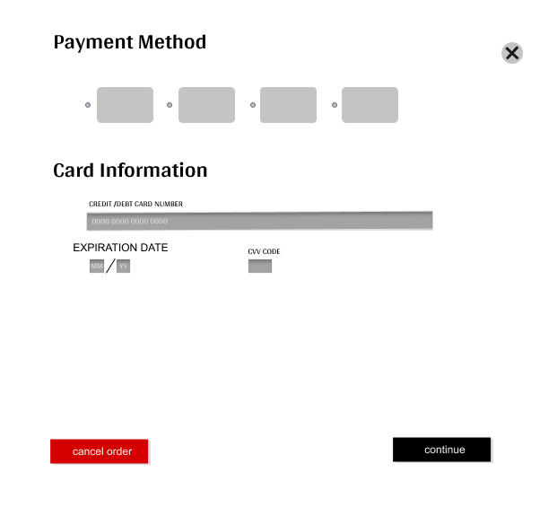
A module was introduced for Zine/Book descriptions and check out forms.
The module uses progressive disclosure to keep the user on a single page.
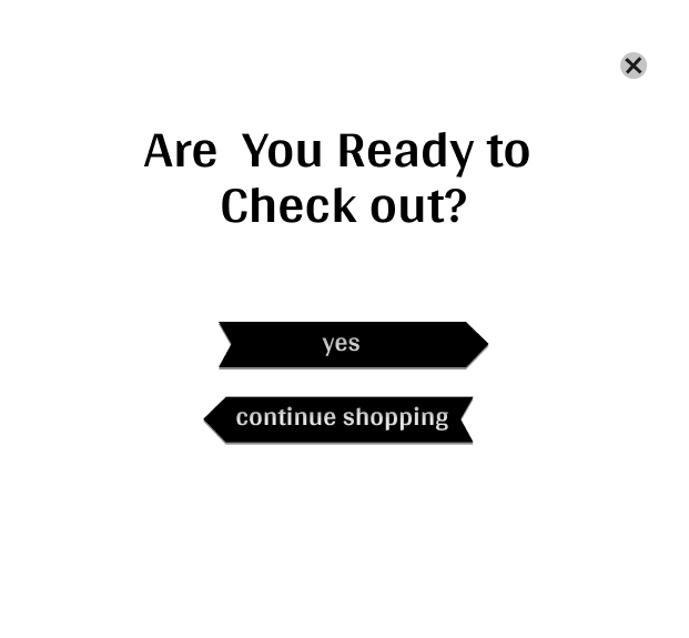
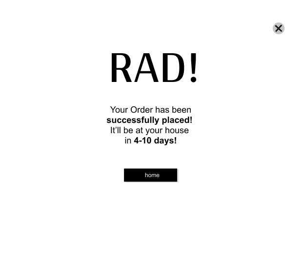
A confirmation page that gave the users some reassurance was important.
Usability Test
Usability testing with 4 users revealed 3 major issues with my initial prototype.
1.The text was too small and hard to read
2. My overuse of the article page for filler was a little confusing.
3. People wanted to know when there book was arriving.
Prototype the Squeakquel
Addressing insights from the usability test,a more specific sample article pages was added to certain flows.
The text in the drop down, body text, and product labels were increased in size and given a more legible font.
Users also expected a specific page for each shop category, so I built a page.
Final Design
Results and Reflections
-While the final site is fine, I think the Visual Design Still needs improving.
-I feel like I should’ve done more user research on the current site design
-More user interviews with Quimby’s customers to get a firmer idea of what is needed.